Wednesday 4 May 2011

Evaluation

EVALUATION

In what ways does your media product use, develop or challenge forms and conventions of real media products?


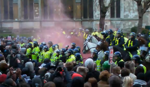
My newspaper uses the conventions of a typical newspaper. I researched established newspapers such as The Sun, The Daily Mirror, The Daily Telegraph and also online news sites such as The Spoof and The Onion. I developed my ideas through taking different ideas from various newspapers. My newspaper is a newspaper but also has pastiche elements to it. It is aimed towards students 16-21 across Essex, I am not aware of any other student newspapers in this area so would be very unique. By using the codes and conventions from other well established newspapers I have been able to produce a professional look to my newspaper. Although the newspaperwill be pastiche in the layout it will also have humorous stories in it to make the students laugh. The newspaper would not only inform them of events and incidents going on at college and university but also include what is going on out of college/university such as clubs, festivals and other events. It would also include sporting news, and different reviews on things young people are interested in, such as clothing, video games, gadgets and the regulars in newspapers, such as puzzles and horoscopes. I have invented four original things for the newspaper which will make it stand out:


1. Derr Stue - this is a slight imitation on Dear Deidre from the Sun. I have invented the name Derr Stue as the newspaper is called Stu - derr so this is a play with the words. I will give the illusion that Stue is actually a male stu
dent. This colum
n will be different in the way that the stories will be slightly more humorous like the good call advert by Fosters.


2.What they're not telling you - A page of funny but true facts about college a
nd university. The stories will be funny, gritty or even shocking! I haven't seen this idea before and thought it could be a good asset to the originality of the newspaper.

3. I want my newspaper also to be serious in certain ways so I want a page on help for coursework. However to lead it away from
being boring there will be more humorous comments. Such as -
( Don't turn to drugs an
d drink , get your books and think!! Although you think the drugs could help - I've heard it all - it will make
you work faster, stay up later blah blah. The truth is that Albert Einstein had to face it.. work hard and be rewarded, take a short cut and you'll end up lost!! )

4. All the news in 20 sentences. A page that tells the students all the best story lines of the week in 20 sentences. Some stories
may be elaborated on in
the newspaper and some may not. It is too let the students know everything that has happened that week.

5. The newspaper 'The Onion' Has its own joke news channel which they broad cast humorous stories on their website. I think this is a good idea and w
ould like to do it with my web page.

Who is the my intended audience?

I intend to produce a parody college/university newspaper for students aged 16-21 in Essex. The students I am aiming at will be interested in going out and colleg
e/university information. I decided to aim my newspaper at this target audience as I can relate to them and I can write would I would be interested in reading whilst at college.

How does my product differ?

My newspaper is different from most newspapers as it is a parody. However it is not a typical parody in the way it has some pastiche conventions. As well as it being fun I want it to be educational and give useful information. I think humour is a good way of connecting to the age group I am aiming at. My newspaper is different mainly because it is a cross between so many different newspapers - London listing newspapers and parody newspapers such as The Onion and pastiche
newspape
rs such as The Sun. Throughout my research
I haven't found a similar newspaper.

How effective is the combination of your main product and ancillary texts?

When comparing well established newspapers such as The Sun and The Daily Express you notice similarities between there newspapers and there online website. It is important to blend the two well to emphasise familiarity to the reader. Using things like the same colours, same titles, similar layouts and stories are important.

My website pages:


My newspaper and poster:


As you can see there is a clear similarity between the four images. You can see the logo visible on all images and the colours red and yellow splashing out from the images. The layout is also fairly similar between the newspaper and the website. People should visit the site and know instantly they are on the right site.

What have you learned from your audience feedback?


How did you use new media technologies in the construction and research, planning and evaluation stages?

Tuesday 3 May 2011

Poster

POSTER


I made a poster to advertise Studerr. I started off by using a teenage girl as she fits into the criteria of the target audience. I would also make another poster with a teenage boy so that both genders would be targeted too but this is just a preview. The idea of this image is to be a follow on from the catch phrase 'Students read something worth while for once'. Next to the girl reading Studerr is a dictionary, driving theory, thick books and A level course work books. It is meant to be humorous that Studerr is not something worth while. The girl is positioned with her feet up to show comfort and relaxation. There isn't too much information on this page apart from the title, logo, catchphrase and the website. This is because I plan the poster to be at train stations, billboards - places where you haven't got lots of time to read. I kept the colour scheme on the text filling to blend with the newspaper. The background behind the girl is blurred as it is irrelevant and makes the Studerr newspaper stand out more.

Research questionnaire

Questionnaire

I made a questionnaire and handed it out to students in my college. I wanted to find out what there views are on newspapers in there area to help me with the development of my newspaper.


Thursday 20 January 2011

My development: Second page newspaper

The idea of the student riots came from recent events in the news. I decided by using a true life story I will not only be able to write my own feelings on the subject but get some good images. Me and a friend attended the riot and he filmed it. He put the film on YouTube and I used screen shots from it. These were some of the images:


I used the images that I thought looked most effective e.g: images with the bright orange fire, and i used images that looked better with the small sizing.

For the main cover image I used a photo that I made out to be Studerr readers. This is so that the audience feels that the newspaper is involved with the protest.


In the image there is a banner with the slogan 'We're learning not earning' and decided to use this as my subheading. It is catchy and effective for the audience to read.

I have kept the colour scheme with my newspapers second page as I wanted the newspaper to blend well together. The layout is even quite similar to the front page. It is clear to read and stands out well. In the corner I made a symbol with the text 'Caution students revolt!' in the typical warning colours yellow and black. It is cleverly made to fit in with the newspapers colour scheme whilst also being the colours of a typical caution sign. At the bottom of the newspaper I used images of teenagers to emphasise the target audience range again.

Wednesday 20 October 2010

Fonts

Typography is the art and technique of arranging type, type design, and layout of a print product. The arrangement of type involves the selection of typefaces, point size, line length, leading (line spacing), adjusting the spaces between groups of letters (tracking) and adjusting the space between pairs of letters (kerning).Typography is performed by typesetters, compositors, typographers, graphic and print designers, art directors, comic book artists, graffiti artists, and clerical workers.
In typography, serifs are semi-structural details on the ends of some of the strokes that make up letters and symbols. A typeface that has serifs is called a serif typeface (or serifed typeface). A typeface without serifs is called sans-serif.
Serif Font Sans-Serif Font
Letter-spacing, also called tracking, refers to the amount of space between a group of letters to affect density in a line or block of text.
Letter-spacing can be confused with kerning. Letter-spacing refers to the overall spacing of a word or block of text affecting its overall density and texture. Kerning refers to adjusting the space between two letters. If letters in a typeface are spaced too uniformly, they make a pattern that doesn’t look uniform and can look unprofessional. Gaps occur, for example, around letters whose forms angle outward or frame an open space (W, Y, V, T, L)
Letter-spacing adjustments are frequently used in news and print design. The speed with which pages must be built on deadline does not usually leave time to rewrite paragraphs that end in split words. Letter-spacing is increased or decreased by small amounts to fix any 'unattractive' paragraphs.

Leading is the space between lines of text.


Margins, Columns, Gutter, Bleed and Slug

A margin is simply defined as an edge. In typography, the margin is the white space that surrounds the content of a page. The margin helps to define where a line of text begins and ends. When a page is justified, the text is spread out to fill the width of a page.

A column is one or more vertical blocks of content positioned on a page, separated by margins. Columns are most commonly used to break up large bodies of text that cannot fit in a single block of text on a page. Additionally, columns are used to improve page composition and readability. Newspapers very frequently use complex multi-column layouts to break up different stories and longer bodies of texts within a story.

Gutters are the white spaces between two pages of a publication, or more generally, between two or more columns of text.

The slug is a piece of spacing material used in typesetting to space paragraphs. The bleed is when an image or piece of text on a page extends beyond the edge of the paper, (therefore being cropped sightly). It may 'bleed' off one or more sides. In programs such as In Design, a bleed is set to stop any elements of the article from bleeding off the sides, It acts as a guide or a barrier to show us where the paper will end, so when designing, we can stay within the barrier.


TABLOIDS USE SANS SERIF FONTS

WHEREAS BROADSHEETS USE SERIF

My development: front cover

This is the development of my newspaper front cover and inside page.

This is the initial layout I made for my newspaper. I experimented with the colour red and blue as they are bold eye catching colours. However I decided it didn't suit the newspaper as it didn't reflect a newspaper as well as darker colours would.
At this point I changed the theme colour to a dark yellow. To make the newspaper theme dissimilar to the Yellow Advertiser I knew I would have to make some slight alterations. I moved the Master Head to the far left to leave space for my catch phrase 'Students read something worth while for once' - this is meant to be ironic and humorous. The newspaper was slightly conventional in its format at this point which I knew i would have to move away from as it is a parody newspaper. I made a logo for the newspaper which is a stick man holding books. It is supposed to resemble the students at work:
It is only small next to the title however is effective in emphasising the catch phrase 'read something worth while for once'. The first story i wrote was about a South end pub crawl. I understand that the newspaper is aimed to the whole of Essex so I decided to write about an area that is popular to most Essex students.

I thought at this point in my development it is important to get feedback from my peers and this is what I received:
I received a lot of good feedback that I took into account but I mainly focused on the negatives to try and improve my newspaper. The first main negative comment I received more than once is that I need to add more colour to my newspaper. This is when I decided to change the 'derrs' to red. It makes the newspaper stand out as well as the illusion of the word 'derrs'. I also made the word slanted as well to emphasise onomatopoeia. The next criticism that I received was on the sizing of the elements of my newspaper. My peers thought that the title wasn't big enough and therefore I re sized it. After making a few other slight alterations this was the outcome:
At this point I left two boxes blank on the right column for advertisements or another story. I acknowledged that something was wrong with my newspaper at this point. I felt that it didn't stand out enough and was slightly too formal so before carrying on I decided to gain more feedback but this time instead of gaining feedback from my peers I asked two teachers. This is the feedback that I found most affective :


From my teachers feedback I decided that my newspaper needed drastic changes. This is what I started to do:

I decided to cut out some of the images to give the illusion of the image coming out of the page. It also made my newspaper less formal. I also changed some of the columns to make them less predictable on the page. The main thing I changed was a to create a banner across the top for the top story of the week. I then used the pen tool to cut the man arms out of the cover image. Again this was to remove the formality of the page.

Final newspaper front cover:

Description of parody newspaper

PARODY NEWSPAPERS

I found it difficult to come across a parody newspaper as they are not too common. They are typically set as websites although they state being a newspaper website. The two I found were, The Onion and The Spoof.

The Onion

The Onion is an American news satire organization. 61 per cent of its web site readers are between 18 and 44 years old. Since 2007, the organization has been publishing satirical news audios and videos online, as the "Onion News Network". The articles consist of current events both real and fictional. It is a parody newspaper and uses much of its humour by using everyday events as newsworthy and using phrases ironically. A second part of the newspaper is a non-satirical entertainment section called The A.V. Club that features interviews and reviews of various newly released media, as well as other weekly features. The print edition also contains restaurant reviews and previews of upcoming live entertainment specific to cities where a print edition is published. I like that the Onion has a pastiche side to it which I want with my newspaper. It is slightly more parody than I would like my newspaper to be however is a very good example of a light hearted, fun newspaper.

The Spoof


The Spoof was created in 2001 and started slowly, with nearly all contributions coming from Paul. With Mark on board the editorial team strengthened mightily and, thanks to timing and good luck, the site really took off gaining the respect and attention of many tens of excellent spoof and satire writers. spoof focuses upon current affairs, sports, science, gossip and entertainment news but also on simple, good humor writing.

This story from The Spoof expresses true friendship and familiarity towards its reader. This is mainly done by talking to you and using informal writing. It goes as far to using swear words and rude comments almost as if you are talking to a friend. I don't know if I would use swear words in my newspaper as my target audience is fairly young but I will break the 4th wall rule and talk to the audience as this makes you more involved as a reader.

Conclusion
I read both websites thoroughly and realised the main difference between the two is that The Spoof has more fantasy stories whereas The Onion comics real life events. I hope that I could use a cross between the two in my newspaper.

Diary of time scale

This is is the deadlines I have set myself on 28/10/2010.

I want to have most of my blog finished by christmas.

I want to have my newspaper's front cover completed also by christmas.

I want my poster and second page of my newspaper to have been completed by February.

I want my website to be completed by March.

I want my evaluation to be completed by April.

Thursday 30 September 2010

Newspaper research

Newspaper Conventions


A newspapers front page must attract readers, re-enforce a newspapers identity for its readers, clearly define the newspapers point of view on the lead story and indicate what will be covered within the rest of the newspaper to sell the newspaper to the public. Print newspaper front covers are designed to sell to the public. They have to stand out next to all the others on the news stand.

THE SUN


The Sun uses bold colours and bold writing to catch peoples attention. Red is a very vibrant colour and I think it works effectively so I have decided to use this colour in my newspaper. This newspaper front cover doesn't really reveal too much information it is more of a teaser to what is inside. I do like that this newspaper is quite stereotypical and readers know what to expect from it. However the front cover is not emphasising a unique side to it what I want from my newspaper. One element I did copy from this front cover is the way they have used a picture and adapted it on photoshop to make a joke. They have removed John Reid's brain where as I have doctored David Cameron's nose to make him look like Pinnochio.

THE DAILY MIRROR


The Daily mirror is very similar to the Sun in its layout. It has the same bold colour red splashing out from the page. However the Daily mirror reveals even less on its front page mainly emphasising the main story. It expresses what it is about in three different story lines. Firstly being about celebrities with the heading 'Madonna', secondly discussing fashion and thirdly discussing true life stories. The newspaper front page is good at showing what to expect from it but not really giving much away. However with my front page I want to have more information and I want it to be busier so it stands out more to my age group.

THE DAILY EXPRESS


This front page doesn't really appeal to my taste. I find the colour scheme plain. The layout quite boring and standard. I also think the font is too formal for the content. It only shows one main story and doesn't really allow the reader to know what to expect. However the price is quite big and bold showing it is very cheap. This is a good way to attract an audience.

FREE PRESS


This newspaper 'Free Press' has a bold front cover. I like the layout as it is neat and gives all the relevant information. I decided to use this layout when making my newspaper front cover. It is good in how it attracts your attention. The main story is the most eye catching and from there on your eyes move around the less relevant information.


Website research

Website conventions

Website links

Websites offer 24 hour news updates. The job of the website is to make the audience engage with the content so they carry on navigating.


The Sun

The Sun has kept its theme of red throughout the website to emphasise familiarity to there audience. It is very busy which I like as it appeals to my target audience. The stories also include things that would appeal to my young audience, music, crime and celebrities. The layout is quite formal however I think it works effectively as you can receive the information clearly.

The Guardian


The Guardian has typical conventions of a pastiche newspaper website. It is quite bland though with plenty of space not being filled. I think this is because the Guardian is aimed for a target audience much older than mine. I don't think this would appeal well to my audience because the information is too political and serious.