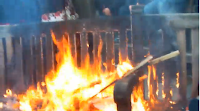


I used the images that I thought looked most effective e.g: images with the bright orange fire, and i used images that looked better with the small sizing.
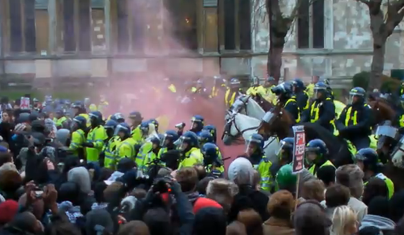
For the main cover image I used a photo that I made out to be Studerr readers. This is so that the audience feels that the newspaper is involved with the protest.

In the image there is a banner with the slogan 'We're learning not earning' and decided to use this as my subheading. It is catchy and effective for the audience to read.

I have kept the colour scheme with my newspapers second page as I wanted the newspaper to blend well together. The layout is even quite similar to the front page. It is clear to read and stands out well. In the corner I made a symbol with the text 'Caution students revolt!' in the typical warning colours yellow and black. It is cleverly made to fit in with the newspapers colour scheme whilst also being the colours of a typical caution sign. At the bottom of the newspaper I used images of teenagers to emphasise the target audience range again.
No comments:
Post a Comment