Wednesday 4 May 2011

Evaluation

EVALUATION

In what ways does your media product use, develop or challenge forms and conventions of real media products?


My newspaper uses the conventions of a typical newspaper. I researched established newspapers such as The Sun, The Daily Mirror, The Daily Telegraph and also online news sites such as The Spoof and The Onion. I developed my ideas through taking different ideas from various newspapers. My newspaper is a newspaper but also has pastiche elements to it. It is aimed towards students 16-21 across Essex, I am not aware of any other student newspapers in this area so would be very unique. By using the codes and conventions from other well established newspapers I have been able to produce a professional look to my newspaper. Although the newspaperwill be pastiche in the layout it will also have humorous stories in it to make the students laugh. The newspaper would not only inform them of events and incidents going on at college and university but also include what is going on out of college/university such as clubs, festivals and other events. It would also include sporting news, and different reviews on things young people are interested in, such as clothing, video games, gadgets and the regulars in newspapers, such as puzzles and horoscopes. I have invented four original things for the newspaper which will make it stand out:


1. Derr Stue - this is a slight imitation on Dear Deidre from the Sun. I have invented the name Derr Stue as the newspaper is called Stu - derr so this is a play with the words. I will give the illusion that Stue is actually a male stu
dent. This colum
n will be different in the way that the stories will be slightly more humorous like the good call advert by Fosters.


2.What they're not telling you - A page of funny but true facts about college a
nd university. The stories will be funny, gritty or even shocking! I haven't seen this idea before and thought it could be a good asset to the originality of the newspaper.

3. I want my newspaper also to be serious in certain ways so I want a page on help for coursework. However to lead it away from
being boring there will be more humorous comments. Such as -
( Don't turn to drugs an
d drink , get your books and think!! Although you think the drugs could help - I've heard it all - it will make
you work faster, stay up later blah blah. The truth is that Albert Einstein had to face it.. work hard and be rewarded, take a short cut and you'll end up lost!! )

4. All the news in 20 sentences. A page that tells the students all the best story lines of the week in 20 sentences. Some stories
may be elaborated on in
the newspaper and some may not. It is too let the students know everything that has happened that week.

5. The newspaper 'The Onion' Has its own joke news channel which they broad cast humorous stories on their website. I think this is a good idea and w
ould like to do it with my web page.

Who is the my intended audience?

I intend to produce a parody college/university newspaper for students aged 16-21 in Essex. The students I am aiming at will be interested in going out and colleg
e/university information. I decided to aim my newspaper at this target audience as I can relate to them and I can write would I would be interested in reading whilst at college.

How does my product differ?

My newspaper is different from most newspapers as it is a parody. However it is not a typical parody in the way it has some pastiche conventions. As well as it being fun I want it to be educational and give useful information. I think humour is a good way of connecting to the age group I am aiming at. My newspaper is different mainly because it is a cross between so many different newspapers - London listing newspapers and parody newspapers such as The Onion and pastiche
newspape
rs such as The Sun. Throughout my research
I haven't found a similar newspaper.

How effective is the combination of your main product and ancillary texts?

When comparing well established newspapers such as The Sun and The Daily Express you notice similarities between there newspapers and there online website. It is important to blend the two well to emphasise familiarity to the reader. Using things like the same colours, same titles, similar layouts and stories are important.

My website pages:


My newspaper and poster:


As you can see there is a clear similarity between the four images. You can see the logo visible on all images and the colours red and yellow splashing out from the images. The layout is also fairly similar between the newspaper and the website. People should visit the site and know instantly they are on the right site.

What have you learned from your audience feedback?


How did you use new media technologies in the construction and research, planning and evaluation stages?

Tuesday 3 May 2011

Poster

POSTER


I made a poster to advertise Studerr. I started off by using a teenage girl as she fits into the criteria of the target audience. I would also make another poster with a teenage boy so that both genders would be targeted too but this is just a preview. The idea of this image is to be a follow on from the catch phrase 'Students read something worth while for once'. Next to the girl reading Studerr is a dictionary, driving theory, thick books and A level course work books. It is meant to be humorous that Studerr is not something worth while. The girl is positioned with her feet up to show comfort and relaxation. There isn't too much information on this page apart from the title, logo, catchphrase and the website. This is because I plan the poster to be at train stations, billboards - places where you haven't got lots of time to read. I kept the colour scheme on the text filling to blend with the newspaper. The background behind the girl is blurred as it is irrelevant and makes the Studerr newspaper stand out more.

Research questionnaire

Questionnaire

I made a questionnaire and handed it out to students in my college. I wanted to find out what there views are on newspapers in there area to help me with the development of my newspaper.


Thursday 20 January 2011

My development: Second page newspaper

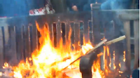
The idea of the student riots came from recent events in the news. I decided by using a true life story I will not only be able to write my own feelings on the subject but get some good images. Me and a friend attended the riot and he filmed it. He put the film on YouTube and I used screen shots from it. These were some of the images:


I used the images that I thought looked most effective e.g: images with the bright orange fire, and i used images that looked better with the small sizing.

For the main cover image I used a photo that I made out to be Studerr readers. This is so that the audience feels that the newspaper is involved with the protest.


In the image there is a banner with the slogan 'We're learning not earning' and decided to use this as my subheading. It is catchy and effective for the audience to read.

I have kept the colour scheme with my newspapers second page as I wanted the newspaper to blend well together. The layout is even quite similar to the front page. It is clear to read and stands out well. In the corner I made a symbol with the text 'Caution students revolt!' in the typical warning colours yellow and black. It is cleverly made to fit in with the newspapers colour scheme whilst also being the colours of a typical caution sign. At the bottom of the newspaper I used images of teenagers to emphasise the target audience range again.